Create self-driving software, the operating system for any autonomous vehicle across any industry. Formerly Oxbotica, we created a distinctive premium brand identity for this innovative Oxford University spinout. Helping them achieve their ambition to change the way the earth moves and their expansion into North America.
Delivering brand guidelines, a brand book, vehicle designs for their existing fleet and new partner vehicles. Environmental graphics for Oxford and Toronto offices and test site at Culham. Working with other agencies to creatively direct their new website and two brand films, along with a brand launch at Google HQ.
— Brand identity
— Logo design
— Brand guidelines
— Environment design
— Creative direction
oxa.tech
Driven by the ambition to accelerate the adoption of machine learning to solve some of the world’s most challenging problems. Lead by a team of bright futurists and based at the heart of London’s fintech community, regularly hosting events for data scientists and machine learning enthusiasts. Seldon are also guest advisors to the UK’s all party parliamentary group for AI.
Products range from open source technologies to bespoke solutions developed for large organisations to embrace the power of machine learning. We soon identified the key audiences that Seldon needed to address and lead to the idea of building a website which could talk to the Tech or Exec at the click of a button.
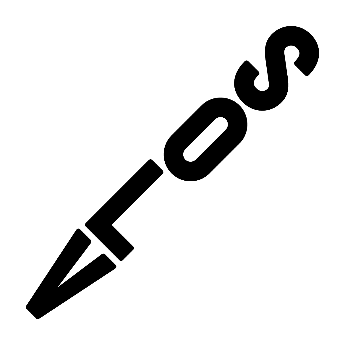
We created the enigmatic word mark which connects with itself, tirelessly building steps into the future. Supported with a restless kinetic S symbol which drives a dynamic visual style including the linear illustrations, iconography, along with the vibrant colour palette. The visual identity has been applied to digital and exhibition spaces.
A fintech aiming to challenge and liberate the financial industry from the limitations of their legacy data systems.
We created a forward-facing brand identity that sits amongst ‘traditional’ competitors in the finance industry as disruptively as Finbourne’s technology does in the marketplace.
— Competitor analysis
— Brand identity
— Website design
— Print collateral
An international e-commerce store selling products for around the home.
Haysoms required an extensive brand overhaul with the verve and versatility to accommodate their rapid growth and expansion. To begin, we addressed the brand architecture, consolidating several in-use brand names to ensure all aspects of the business would now fall under the one brand name. We then completely overhauled the existing identity, creating a contemporary and dynamic visual language encompassing logo with custom typography, a versatile system of icons, and a series of playful illustrations.
— Brand architecture
— Brand identity
— Illustration
— Print collateral
A new podcast that reaches right to the heart of the opera industry. The Opera Pod offers a backstage pass into the world of opera, with guests including singers, directors, designers and producers, interviewed by an industry insider, but accessible to all.
We wanted to get to the core of opera and saw music as the unifying element and recognisable to everyone. Musical notes create the negative space within the opera word mark letters, this is supported by the informal and approachable hand written script font.
The logo has been designed to work on various digital platforms and across social media. A simple visual style was created and applied to key touch points and merchandise to promote the podcast.
Bringing a new upscale hotel brand to life through hotel branding, marketing collateral and materials to inspire employees to be part of the voco family. Developing opportunities to extend the voco thread through other products and services including a retail offer.
— Brand development
— Brand implementation
— Employee branding
Training materials for the launch of several new co-living spaces across London and New York.
— Brand implementation
— Employee branding
— Illustration
A highly regarded retouching studio working with major international ad agencies and brands.
Due to a legal conflict with their previous name (Tank), we were called in to help take advantage of this hiccup — rename the company and create a completely new brand identity to express it.
We wanted to know more than just a list of services on offer, we wanted to know about our client’s drive, motivations, and the more abstract nature of their business and craft (CGI, retouching, animation). Realising that through what they described as their ‘dark arts’, Tank often act as a ‘third eye’ for their clients — we had stumbled upon their new name; Third Eye Studio. The visual brand was developed to push this mysterious and fantastic angle.
— Naming
— Brand identity
— Print collateral
— Website design


